Mando allows you to fully customise your AI agent to match your brand. Under Channels > Website Messenger, you’ll find two tabs: Content and Style. This guide walks you through each section and setting to help you create a seamless, branded experience for your users.
Content Tab
This tab lets you define what your messenger says, how it behaves, and what content it connects to.
How to Install the Script
Copy the script provided and paste it into the <head> section of your website. This script is required to activate the messenger and make it visible on your site.
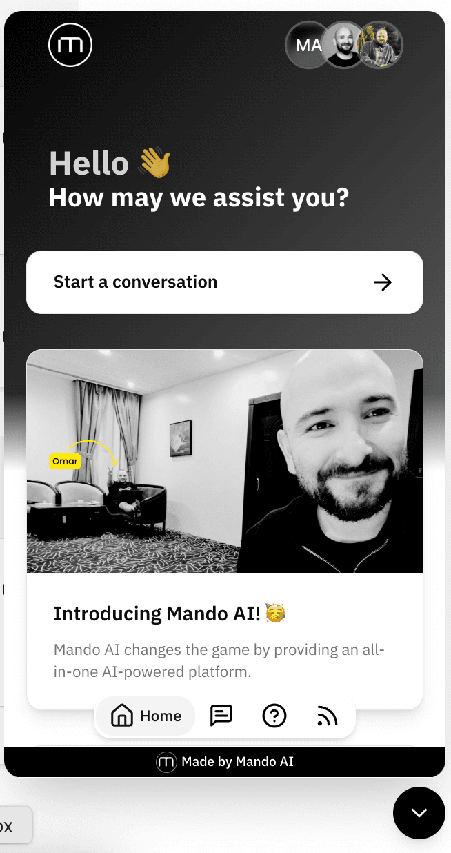
Home Page Settings
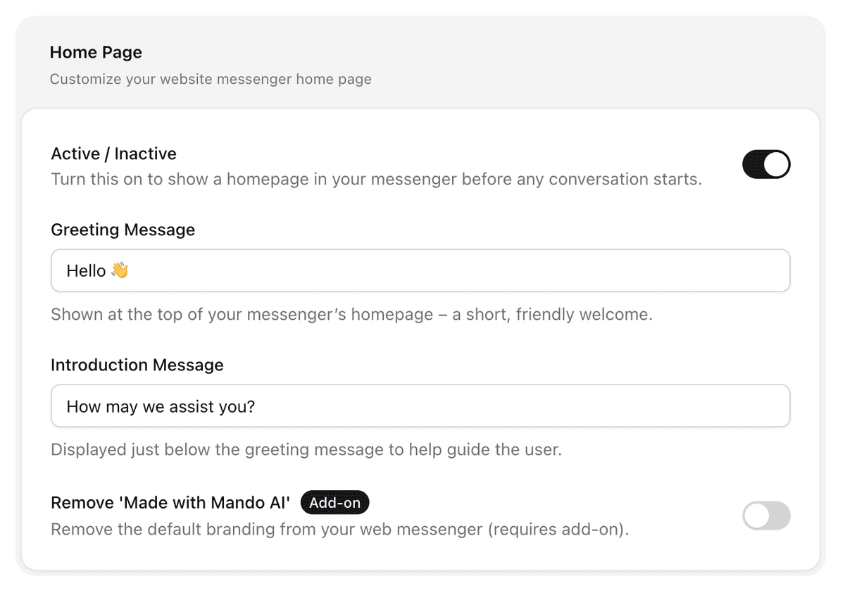
Active/Inactive
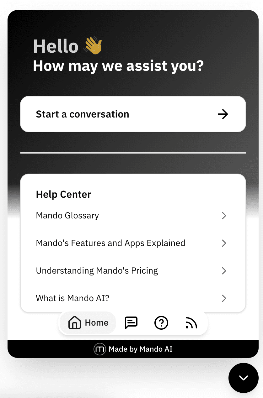
Enable or disable the home screen of the messenger that appears before users start a conversation.
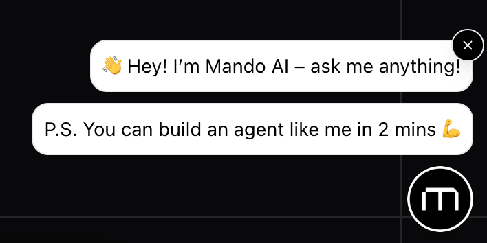
Greeting Message
Appears at the top of the chat home screen. Use a friendly, concise message to welcome users.
Introduction Message
Appears under the greeting message. This can guide users or prompt them to ask a question.
Remove ‘Made with Mando AI’
Optional add-on that allows you to remove Mando’s branding for a white-labelled experience.
Conversations Page
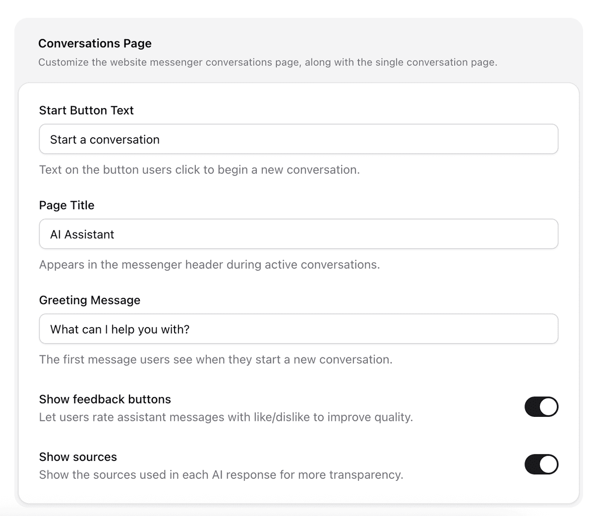
Start Button Text
The label on the button that users click to start a new chat.
Page Title
The title displayed at the top of the chat window during active conversations.
Greeting Message
The first message your AI agent sends when a chat begins.
Show Feedback Buttons
Enable this to let users rate AI responses with a thumbs up or down. Useful for tracking response quality.
Show Sources
When enabled, sources for AI-generated responses will be shown. Recommended if transparency is important.
Help Center Integration
If you’ve already created a Help Center, you can display it directly inside the chatbot, giving users quick access to your support articles without leaving the conversation.
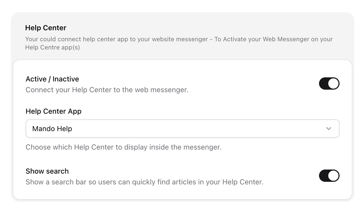
Active/Inactive
Toggle to display your Help Center inside the chat interface.
Help Center App
Choose which Help Center app to link to this AI agent.
Show Search
Enable a search bar within the messenger so users can quickly browse your Help Center articles.
Also Help Center articles marked as “Featured” will appear on the chatbot’s homepage. You can control their visibility at any time by adjusting the “Featured” setting within each article in the editor.
Newsroom Integration
If you have a Newsroom app set up, you can showcase it inside the chatbot to share your latest announcements, updates, or blog posts. Once activated, users will be able to browse your Newsroom content without leaving the chat experience.
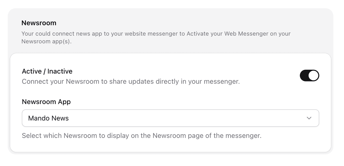
Active/Inactive
Toggle to show your Newsroom app within the messenger.
Newsroom App
Select the specific Newsroom app you want to link.
Only Newsroom posts marked as “Featured” will be displayed on the chatbot’s homepage. You can manage which posts are featured from within the Newsroom editor by toggling the “Featured” setting on or off.
Styling Your Web Messenger
The Style tab in Mando’s Web Messenger settings allows you to visually align your AI chatbot with your brand. From colours and fonts to logos and tooltips, every detail can be adjusted to create a cohesive experience.
Below is a breakdown of each section within the Style tab:
1. General
This section covers your base branding styles such as colours and fonts.
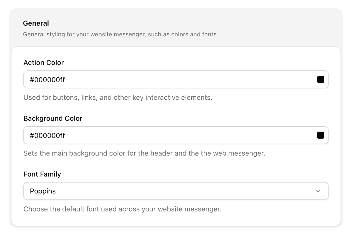
Action Colour
This is the main colour used for interactive elements like buttons and links inside the messenger.
Background Colour
Sets the main background for the messenger interface, including the header.
Font Family
Choose a font that matches your brand style. This will be applied across all messages and headings inside the chatbot window.
2. Launcher
This section controls the small icon launcher/chat bubble and the tooltip messages shown to users.
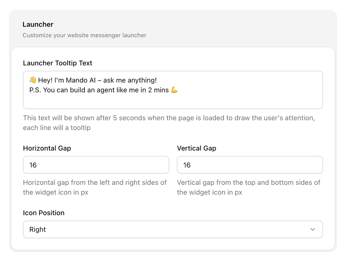
Horizontal Gap
Sets padding between the icon and the left/right sides of the screen.
Vertical Gap
Controls spacing from the top or bottom of the screen (depending on icon position).
Icon Position
Choose whether the launcher icon sits on the right or left of the screen.
Tooltip Messages
Tooltips are rotating one-line prompts shown before a user engages with the bot. These messages help attract attention and encourage users to interact.
Enter one line per tooltip. These appear 5 seconds after page load to grab attention. Each line will rotate as a separate tooltip.
Examples:
Need help with an order?
Ask about our current offers
Looking for a specific product?
Browse help articles instantly
3. Header
This section affects the header that appears at the top of the messenger chat window.
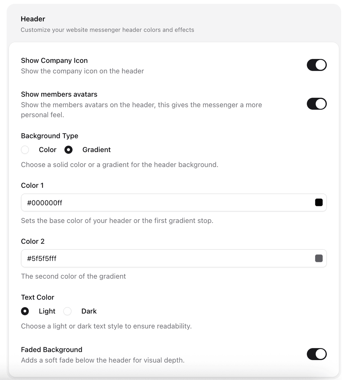
Show Company Icon
Toggle on to display your company’s logo in the header.
Show Members’ Avatars
If enabled, avatars of your human agents will appear in the header during handoff conversations, making the experience more personal.
Background Type
Select solid colour or a gradient background for your header.
Colour 1 and Colour 2
These define the colours used in your header, especially if gradient is selected.
Text Colour
Choose between light or dark text depending on your background colour to ensure readability.
Faded Background
Adds a soft visual fade effect beneath the header for depth.
4. Icons
This section allows you to upload brand-specific icons for different parts of the messenger.
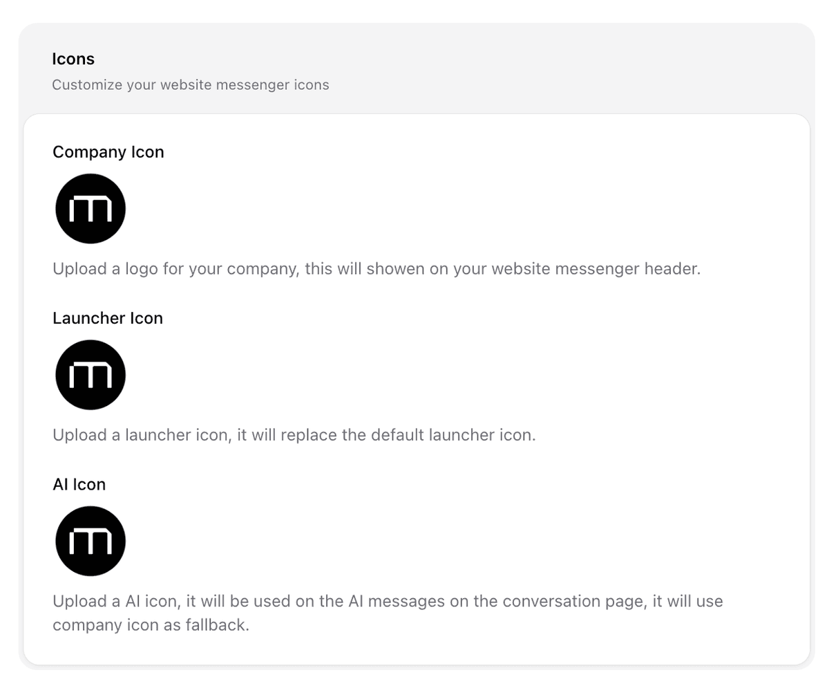
Company Icon
Displayed in the messenger header if enabled.
Launcher Icon
This replaces the default chat launcher icon with your own.
AI Icon
Used in AI-generated messages to distinguish them from human agents. If not uploaded, your company icon will be used as fallback.
Final Tip
Use the Preview button to instantly see your changes. Once you’re happy with the look, publish or refresh your website to view it live.
Note: To see the changes live on your website, it might take a few minutes.